March 25, 2012

Fritillary Butterfly, Elsah, IL


        This is an edit of a photo I previously posted (see the original below). There was too much competition between the subject and the background. Isolating the butterfly makes the subject more interesting - keeping it's vibrancy while subduing the rest. I adjusted the basic levels and got nowhere. So I decided to take a different approach. I hand selected the butterfly, inverted that selection - only the background was selected- then brought down the saturation. As a result: the background lost some color and the bug is bright. 

        Notice the fuzzy places around the edges of the butterfly? That is me trying to compensate for a not-so-good selection by using the smudge tool. I even had to use the stamp tool above his right wing. 

        In the end I achieved the affect I wanted. It's a much stronger image now. There are limitless ways you can approach a problem like this. How would you solve it? Have a go at it. Feel free to download the original image below and alter to your hearts content. If you do please make a comment with a link to the image you came up with. Yes, I am giving you the right to copy this image, but please use it only for the purpose just stated. Thanks. 


March 22, 2012

Statue depicting "Art" at the Boston Public Library


        It was a rainy morning in Boston. A friend and I were to meet up for a movie that day. Last we spoke the Copley Square Library entrance was the meet up point, but we lost communication on the subway. I found myself waiting at the steps of the Boston Public Library admiring the ethereal quality of the overcast cityscape. I have always appreciated the two statues flanking the steps leading up to the Library entrance, but with the rain and the diffused light they stood out to me even more.

Anyone who has shot in the rain knows that keeping your photography gear dry while shooting is not a simple task. Imagine me fumbling with a large umbrella while crouching down with my camera in both hands and all the while the rain sneaking in. As awkward as the process can be the results are well worth the effort.  Most people hide there cameras from the rain and don't put up with clumsy scenarios like mine. The brave few have an opportunity to capture images that convey a wonderful sense of atmosphere and mood. Next time you are thinking about shooting pick the rainiest day you can, grab your umbrella, and explore a whole new world that most of unwittingly miss.

Keep in mind that in these overcast conditions your subject is not as bright as you perceive. You will need to adjust your camera settings to get a shot that is not blurry from a too long exposure and camera shake, or better yet use a tripod. The photo above was the best of about 30 shots and I spent some time developing the final image in my editor. 

Chestnut Hill Reservoir Effluent Gate House


March 19, 2012

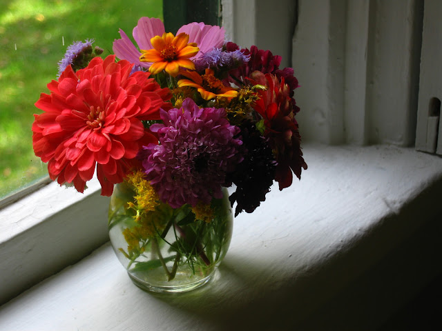
Three Rivers Community Farm Flowers


        I had the opportunity and the privilege to work on Three River Community Farm in Elsah, IL the summer after graduating from Principia College. One of the greatest things about working on a farm is that you get to take home the freshest vegetables you will ever eat, and sometimes flowers come along with the deal. This is an image of an arrangement I made from flowers I took home from the farm. The houses in Elsah village are quaint and old. The subject is on a window ledge inside one of those historic homes. 

        The range of value is what appeals to me. It has the darkest darks, the bright whites, and a full range in between, not to mention the vibrant hues. This is expressed in the environment and also in the subject itself, creating a complete harmony. 

        There is a lovely relationship between the darkest part of the subject and the bright light on the window sill. As much as I like that bright red flower on the left I may crop most of it out to focus on that silhouette. It seems logical to either make the focus of an image be the relationship of hue or the relationship of value (I have never considered that before). Both are very much prominent in this image. So what I may do is bring down the saturation and play with the value to emphasize the gently diffused light and the shadow on the flowers. Onward and upward. 


Train Stop from Newark to New York


        The crisp, saturated quality of this image is the result of long exposure. I believe this was a 15 second shot. This is how the image came out of the camera. No editing. Notice that it is focused from the foreground to the back.


March 16, 2012

Photo Theory


A little bit on my developing photo theory:

        Photography is all about light values, and the way those different values relate to each other. If you can recognize that and bring it out in the shooting and editing process then you are on the right track. The essence of photography is to make a record of light. Photo-graph, a "light record". Never loose sight of that.

        Concepts, metaphors, messages, symbols, etc. can all be put on the back burner. The beautiful characteristics of light is a sufficient concept to portray. Light relationships speak to the heart more than intellectualism. And you can say as much, or even more, with the beauty of light as with conceptualism.


New York City Sky-scraper


        Here we have a photo looking up at a sky-scraper in New York City, with some nice wispy clouds above. I love how the lines in the image all converge in that bright, etherial cloud formation. 

        This picture was recorded during my 2nd stay in New York. My first visit to New York was overwhelming. I was with my brother, and it was his first time as well. During that trip I mostly stayed in Central Park and read. Kinda felt like being in an airport all day. The second time around was quite different. A family friend who knew the city well showed me around. Suffice it to say it felt more grounded. This picture came out of that trip. Below I have posted the original image, and below that I have written a little about my editing process and photo philosophy. 


        Not nearly as satisfying huh? It only took a minute or two to come up with the enhanced image at the top of this post. I simply adjusted the brightness, contrast, and levels until I was happy with the result. 

        Don't take your photo for what it is! It can ALWAYS be better with a little tweaking here and there. For me this is where the art of photography comes to life.


March 13, 2012

Gray Jay eating from hand, BC Canada


        I was hiking with a group in Canada, when we discovered that the Jays in this particular area are quite comfortable with people. If you hold food out for them they will perch on your hand, grab it and fly off. I have never experienced that anywhere else. Jays are known for having very shrewd, opportunistic  characteristics. Someone told me of a Jay that watched a squirrel hide it's nuts, and then dug them up for himself. That same squirrel then buried more nuts in the same places, and the Jay dug them again!


The Exposure Triangle


        Ever heard of the exposure triangle? Three of the most important camera functions to keep in mind when shooting in manual mode are ISO, shutter speed, and aperture. Read more about it here. This post will change the way you think about photography.

http://www.digital-photography-school.com/learning-exposure-in-digital-photography


March 9, 2012

Boston skyline from Memorial Drive looking across the Charles River


        This image of the Boston skyline is one of the first "raw" format photos taken with my new Cannon Rebel T3.

        When shooting in raw format it means that your camera has not interpreted, or developed, the image for you. In a sense it is like having a negative. With a raw image you have much greater editing capability.

        When shooting in a format other than raw your camera is automatically turning the image you have taken into a file format, like jpeg. In the process of doing this a LOT of "information" is lost or condensed. The range of value and color is diminished, details hidden in the dark shadows - which only seem invisible, but are retrievable - are lost.

        Because it is so much like a photo negative to me it seems unnecessary to post the original image, but for educational purposes and comparison, her is the unedited image.


        Next time I  go to this location I will bring my tripod, close down the iris and leave the shutter open for 15 seconds or so. That should make for a richer image. The water will come through very smooth and glassy. There should be a greater sense of depth overall.

        This image was taken before I pushed myself to use the full manual mode, so I took this using the "night" setting. The creative potential of this subject is much greater than I was able to make use of on the night mode. Check back with my blog in the future for an improvement on this scene.


March 7, 2012

Light streaks Rocky Mountain


While a passenger in a car driving along a road in the rocky mountains, I took this photo. It was shot using my good old Cannon Powershot Digital Elf. Have had that camera for years. It has two layers of scotch take holding the body together. Anyway, this was a long exposure out of a car window.

We can see a number of different elements here. The car lights moving across the picture, what looks like the ground on the bottom left, some kind of reflection at the top (is that my face face reflected in the glass, or maybe the camera itself?), then in the top right we have some kind of light that looks like musical scores to me. There is some sort of musicality to this picture. A rhythm or cadence to the patterns and shapes. That wispy gold thread in the bottom right has a lovely voice doesn't it? It's almost a finale. And isn't there a kind of narration to the whole piece? A certain flowing logic. A beginning, a middle, and a wispy, gold ending? What music do you see?

Here is the photo as my camera interpreted it.


You can see I heavily edited this. Some of the colors have been changed completely to get the affect I wanted. When I edit a photo intuition, experience, and trial and error all come into play to get it looking the way I want. And often what I want is not defined until I actually get there. 

The piece at the top is a version I made for printing. I made it quite bright to compensate for the darkening affect that printing has on a digital picture. When you go from the pixel to ink medium you loose a lot of the brightness in an image. 

Below is the piece as I edited it for pixel viewing. Much better huh? Easier to look at. If you ever print your digital photos keep in mind that you don't have pixels projecting your image as rays of light. The print medium works in a completely different way. The physics involve a different process, where light is bouncing off of the pigments on the paper and entering your eye. I don't know the exact reason, but it is simply going to be darker when printed. Find out how to compensate for this by reading the paragraph below the image.


Here is what you do to find out just how much you need to brighten your photo to get it ready for printing. Start by printing a version of the piece as it is. It will be quite darker than what you see on your computer monitor. While looking at both the digital version and the dark print of the picture lower your computer monitors brightness to mach the printed version. This will calibrate your monitor to a printing level. Now bring the brightness of the photo up, in your editor, and it should print at the same level that you are seeing on your monitor.

Try this out now. Bring the brightness of your computer monitor down and scroll back up to the image at the top of this post. What you will see is pretty close to what the image looks like when printed. Even some of that crisp, rich information gets lost when converting to a print image, as it does when bringing down the brightness of the monitor. 

Perhaps there is actually a science to doing this. This method is just what has worked out in my experience. I would think that a program like Photoshop would come with this compensation built into it?? Printing photos for display is still relatively new to me. Onward and upward. 

March 4, 2012

Mt. Vernon st. Brighton, MA


To take this photo a number of things happened simultaneously while the shutter was open. For starters the flash fired, exposing the foreground and mid-ground, which "burned" them into the picture. The background had the lighting of street lamps causing them also to expose clearly. While the flash fired and the shutter opened I zoomed in with my lens. Making the streaks of light expose as lines leading to the center of the image. The foreground (the street, sidewalk and fire-hydrant) remains clear because after the flash fired that space was nearly black and reflected very few light waves to the imaging sensor. The houses, street lights and moon at the top are all lines of light because while I was zooming in they were still sending light waves to the sensor. 

A lot happened to make this image, but keep in mind that it only took a fraction of a second. I hit the shutter button on the camera while zooming in. 

I took a dozen or more shots this way. This is the one that turned out best. There is always a process of trial and error. Persistence and playing around pay off. Enjoy the process, or you will never take enough photographs to develop your technique or learn unique ways of shooting.

Below is how I would edit the picture.


And below is a very different example of a photo I took during the same shoot. Don't ask me how I got this one. I am trying to figure that out myself. It must have been a perfect camera rotation 


March 1, 2012

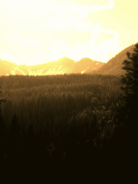
Estes Park, Rocky Mountains, CO in sepia (edit progression)


This image is great in sepia tones. Check it out this color photo of the same scene here.


The sepia photo ties everything together. Making it easier to look at. Notice that the eye is drawn to the clouds in the sepia image, while the color image draws the eye to the landscape (which is not as interesting or as strongly composed as it could be).

On the other hand that green is really nice. And check out the way it blends with the gray on the gentle slope in the right of the picture. It has it's redeeming qualities for sure. 

So how would I edit the sepia version? Crop some off of the bottom and right hand side for starters. Then straighten it. That's it for now,


And there you have a stronger image.

The mountain ridge cut the original picture in half, muting the interest of the whole piece. And since I enjoy the quality of the clouds, I cropped off the bottom of the photo to bring the focus upwards. See, there is a reason why we have the rule of thirds. It can be broken, but it does help to create interest.

February 28, 2012

Purple, Beige, light streaks, 17 Mt. Vernon st. Brighton (edit progression)


This photo was taken with my new Cannon Rebel T3, at night on the "night" setting (it's brand new, so I am still getting used to full manual). I simply moved the camera upwards while the shutter was open collecting the light. It is drawing with the light (witch in this case are street lamps). Notice the houses in the lower left.

When I shoot this way I never know what I am going to capture. This trial and error process is very enjoyable. Just as fun as framing and composing a picture. You never know what you will get.

When I look at this photo I get a sense of upward movement. It makes me think of a space bound craft lifting off to escape the confines of gravity.

To improve the image I would crop a quarter off on the right and left and boost the contrast a little.


There you go.

I just did that in a couple minutes using a free photo editor. You can see how much stronger it is this way. I did boost the contrast a bit and darkened the image a tiny bit. Just enough to darken the sky. I also tried adjusting the levels but didn't care for the results. Same deal with saturation. When you bring down the saturation it starts to become a black and white image. I like the contrasting colors in this photo. I think it is just right. I could go in there and start playing with the hues, but then I would be here all night.

There are people who tell me that they don't think photo editing is a good idea. If they took the time (and it can be very time consuming) they would fall in love with photography even more. Editing your photographs is key to developing a good eye for when you are shooting. It causes you to really think about the subject, composition, color, everything about the picture. Consider that not editing a photo is like taking your film to a 1hr. developer, and taking what you get. In a way, an unedited photo is like a film negative with an unlimited potential for creative development. Don't let your digital camera have the final say in the "development" of your photographs. EDIT!!

February 15, 2012

Butterfly


Jumping spider on a bicycle "bowden cable"


Light streaks and happy accident


This picture came about in an unexpected way. I started out with a photo I had taken in a car at night driving down a city street. I slowly rotated the camera and wobbling it from side to side while the shutter was open for a number of seconds. Here is the picture as I took it:


While editing the picture I wanted to do something to make it more substantial. After a lot of adjusting and readjusting of hues, contrast, brightness etc. I accidently hit the fill button on a bright space of the picture and it happened to be the blue/green color you see in the finished piece. This filled in all of the white spots.